We Inspire To Create
Typography
Choosing the Right Font for Your Brand
When selecting fonts for branding, it’s essential to consider the tone and message you want to convey. Different fonts evoke different emotions and associations, so choose one that aligns with your brand’s personality and the audience you’re targeting.
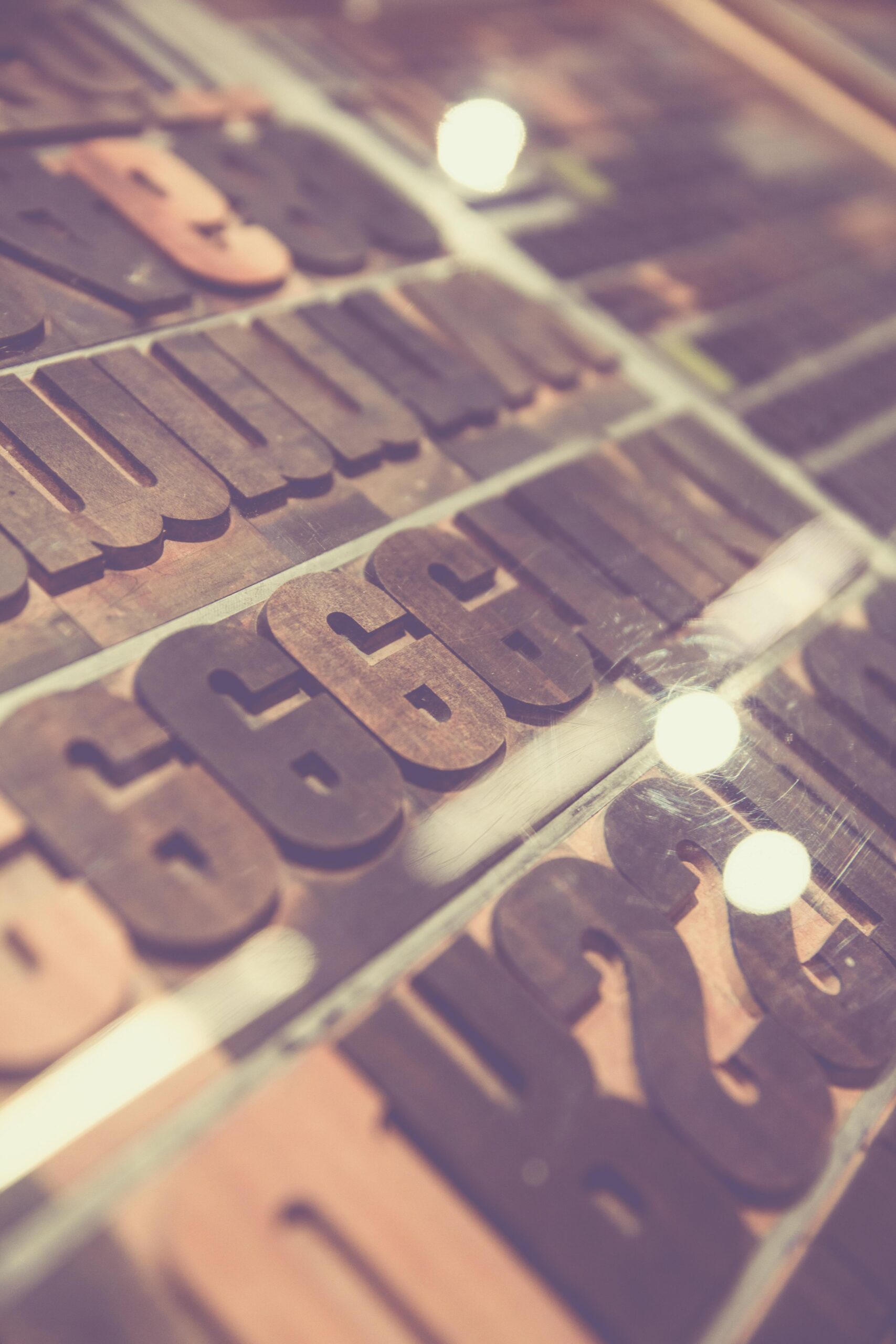
The Importance of Typography in Branding!
Typography is a crucial element of branding, influencing how a brand is perceived and communicated. Here’s why it matters:
Establishes Brand Identity: The choice of fonts reflects a brand’s personality, whether it’s modern, traditional, playful, or professional.
Enhances Readability: Good typography ensures the brand’s message is clear, easy to read, and accessible across different media.
Evokes Emotion: Fonts can convey feelings and tone, helping create an emotional connection with the audience.
Maintains Consistency: Consistent use of typography across all touchpoints builds recognition and trust, strengthening the brand’s image.
Reflects Values: Typography communicates a brand’s values and story, reinforcing its mission and ethos.
Improves User Experience: Well-chosen fonts enhance usability, making it easier for customers to navigate and engage with content.
Differentiates the Brand: Unique typography helps a brand stand out and be memorable in a competitive market.
Supports Versatility: Effective typography adapts across print, digital, and social platforms, maintaining consistency in all formats.
Guides Attention: Typography helps prioritize content and directs the reader’s focus, improving overall communication.
Tells a Story: Typography can express a brand’s narrative, reinforcing its tone, heritage, and values.
In short, typography is a powerful tool in branding that shapes identity, communication, and emotional connection, playing a key role in creating a memorable and effective brand experience.
Do you Know?
The Psychology of Color
Typography Approach by top brands
BMW
Font: BMW Typeface (custom font)
Typography Approach: BMW’s logo features a custom sans-serif font with clean, sharp lines. The font is bold, modern, and geometric, reflecting the precision and performance that BMW vehicles are known for. The uppercase letters give the brand a sense of authority and reliability.
Message: High-performance, precision, and luxury.

Tesla
Font: Tesla Custom Typeface (modified sans-serif)
Typography Approach: Tesla's logo features a custom, sleek, modern sans-serif font with a futuristic feel. The sharp, angular edges and thin letterforms emphasize the brand's innovation in the electric vehicle market. The font is simple yet powerful, reflecting the cutting-edge technology and bold vision of the company.
Message: Innovative, futuristic, and premium.
Font: Product Sans (custom font)
Typography Approach: Google’s logo uses Product Sans, a modern, geometric sans-serif typeface created specifically for the brand. The font is clean, friendly, and easily legible, reflecting the brand's approachable and user-centric design philosophy. The use of bright, primary colors in the logo further emphasizes Google’s youthful and playful brand personality.
Message: Approachable, modern, and user-friendly.
Microsoft
Font: Segoe (custom font)
Typography Approach: Microsoft uses the Segoe font family for its logo and branding materials. Segoe is a contemporary, clean sans-serif font designed for readability and versatility. Its smooth, rounded forms convey a sense of trust and clarity, fitting for a company that serves millions globally through software like Windows and Office.
Message: Trustworthy, professional, and accessible.
Apple
Font: San Francisco (custom font)
Typography Approach: Apple uses a custom, sleek sans-serif font called San Francisco in its logo and across its marketing materials. The font is modern, clean, and highly legible, aligning with the brand's focus on simplicity, innovation, and premium design. It represents a futuristic and minimalist aesthetic, fitting with Apple’s reputation for cutting-edge technology and high-end products..
Message: Sophisticated, minimalist, and high-tech.
Nike
Font: Nike Futura (customized version)
Typography Approach: Nike uses a modified version of the Futura font in its logo. The bold, geometric sans-serif font has strong, clear letterforms that give the brand a sense of energy and dynamism. The font's sharp edges and clean lines align with the brand’s sporty and active nature.
Message: Bold, dynamic, and empowering.
Coca-Cola
Font: Spencerian Script (handwritten-style font)
Typography Approach: Coca-Cola's logo is one of the most recognizable in the world, largely due to its distinctive, flowing script. The font used is based on Spencerian Script, a popular style of penmanship from the 19th century. This cursive design exudes a sense of tradition, nostalgia, and warmth, appealing to consumers' emotions and reinforcing the brand’s long heritage..
Message: Classic, refreshing, and nostalgic.
McDonald’s
Font: Lovin' Sans (custom font)
Typography Approach: McDonald’s recently introduced a modern sans-serif font called Lovin’ Sans. It is rounded, friendly, and simple. This typeface conveys approachability and fun, aligning with McDonald’s family-friendly image. The boldness of the font, combined with the famous golden arches, creates a strong sense of recognition.
.
Message: Friendly, accessible, and joyful.

Amazon
Font: Amazon Ember (custom font)
Typography Approach: Amazon's logo utilizes Amazon Ember, a custom sans-serif typeface designed specifically for the brand. The font is simple, clean, and professional, with a slight roundness that makes it more approachable. The smiling arrow that connects "A" to "Z" adds a playful element to the otherwise straightforward design, symbolizing convenience and range.
Message: Professional, convenient, and customer-centric.

Font: Billabong (for Instagram logo)
Typography Approach: Instagram’s original logo used a hand-lettered script inspired by the Billabong font. The fluid, cursive script represents creativity and the personalized nature of the platform. The updated logo uses a more minimal sans-serif font but retains the essence of simplicity and modernity.
Message: Creative, social, and modern.

YouTube
Font: Roboto (Google font family)
Typography Approach: YouTube's logo uses the Roboto font, a clean, modern sans-serif typeface. This font is widely used across digital platforms and is known for its clarity and legibility. The simple, straightforward design reinforces YouTube’s role as an accessible, user-friendly platform for video sharing.
Message: Digital, modern, and user-centric.

Font: Facebook Sans (custom font)
Typography Approach: Facebook uses a custom sans-serif font called Facebook Sans. The font is clean and modern, with rounded letterforms that make it feel friendly and approachable. It aligns with Facebook's mission to connect people in a social and non-intimidating way.
Message: Social, approachable, and community-oriented.